Introduction
Flyers are a great way to promote your business or event, but creating an effective flyer can be a challenge. Many people struggle with designing a visually appealing flyer that also communicates a clear message to their target audience. In this article, we will provide a step-by-step guide to creating effective flyers, as well as tips for choosing the right colors and fonts, crafting clear messaging, and distributing your flyers to reach your target audience.
Designing Flyers that Stand Out
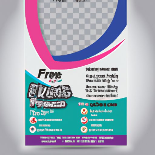
The first step in creating an effective flyer is designing a visually appealing layout that catches the eye of your target audience. Consider the purpose of the flyer and the message you want to convey. Are you promoting a sale? An event? A new product? Your design should reflect your message and communicate it clearly to your audience.
Here are some steps to follow when designing your flyer:
Determine the purpose of the flyer
The purpose of your flyer should be clear from the moment someone picks it up. Make sure your design reflects the purpose of the flyer and communicates the message effectively. For example, if you are promoting a sale, your design should be bright and attention-grabbing, with the sale details prominently displayed.
Define the target audience
Knowing your target audience is key to creating a design that resonates with them. Consider the age, gender, and interests of your target audience. For example, if you are promoting a new yoga studio, your target audience is likely women between the ages of 18-55 who are interested in fitness and mindfulness.
Choose a visual focal point
Every flyer should have a central visual element that draws the eye in and communicates the purpose of the flyer. This could be an image, a graphic, or a headline. Make sure the visual focal point is bold and attention-grabbing.
Incorporate contrast in design
Contrast helps make your flyer visually appealing and guides the viewer’s eye. Use contrasting colors to highlight important elements and make them stand out. For example, if your background is light, use dark text and vice versa.
Ensure readability
Make sure your design is easy to read and understand. Use a bold font for headlines and a legible font for body text. Avoid cluttering the design with too much text or graphics.
Using Graphic Design Tools for Creating Visually Appealing Flyers
Graphic design tools can help take your flyer design to the next level. They offer a wide range of templates, fonts, and graphics to help you create a visually appealing and professional flyer. Some popular graphic design tools include Canva, Adobe Illustrator, and PicMonkey.
To use graphic design tools to create your flyer, follow these steps:
Choose a template
Most graphic design tools offer a variety of templates that you can customize to fit your needs. Choose a template that fits your purpose and target audience, and then customize it with your own images and text.
Use high-quality images
It’s important to use high-quality images to make your flyer look professional. Avoid using blurry or low-resolution images that can make your flyer look amateurish.
Customize your fonts and colors
Use custom fonts and colors that reflect your brand. Make sure your font choices are legible and your color choices complement each other.
Tips for Choosing the Right Colors and Fonts for Your Flyers
The right colors and fonts can make a big difference in how your flyer is perceived. They can help communicate your message and create an emotional response in your target audience. Here are some tips for choosing the right colors and fonts:
Consider your brand
Your flyer should reflect your brand and the colors and fonts you use should be consistent with your brand identity. For example, if your brand is playful and youthful, you might use bright colors and a fun font. If your brand is sophisticated and elegant, you might use darker, more subdued colors and a more elegant font.
Use contrasting colors
Contrasting colors can help your flyer stand out and draw the eye to important elements. For example, if your background is white, use a bold, contrasting color for your headlines.
Choose legible fonts
Make sure your fonts are legible and easy to read, even from a distance. Avoid using fancy or decorative fonts that can be hard to read.
Stick to a limited color palette
Using too many colors can make your flyer look busy and overwhelming. Stick to a limited color palette of 2-3 colors.
The Importance of Including Clear and Concise Messaging on a Flyer
Your flyer’s messaging is what will communicate your purpose and get your target audience to take action. Clear and concise messaging is key to creating an effective flyer. Here are some tips for crafting clear messaging:
Focus on benefits
Your messaging should focus on the benefits of your product or service rather than the features. For example, instead of saying “our product is made with the highest quality materials,” say “our product is durable and long-lasting.”
Use simple language
Make sure your messaging is easy to understand. Avoid using technical language or industry jargon.
Designing Flyers for a Specific Audience and Purpose
Tailoring your flyers to a specific audience and purpose can help make them more effective. Here are some tips for customizing your flyers:
Consider your audience’s interests
Your target audience’s interests should guide your design choices. For example, if you are promoting a music festival, your design should reflect the genre of music and the vibe of the festival.
Adapt your messaging
Your messaging should be tailored to your target audience. For example, if you are promoting a sports event, your messaging should speak to the passion and enthusiasm of sports fans.
The Do’s and Don’ts of Flyer Layout and Composition
The layout and composition of your flyer can have a big impact on how effective it is. Here are some do’s and don’ts to keep in mind:
Do use white space
White space can help make your flyer look clean and uncluttered. Use white space strategically to draw attention to important elements.
Don’t clutter the design
A cluttered design can make your flyer look busy and overwhelming. Keep the design simple and focused.
Do use hierarchy
Make sure your headlines, subheadings, and body text are organized hierarchically to guide the viewer’s eye.
Don’t use too many fonts
Using too many fonts can make your flyer look unprofessional. Stick to one or two fonts that complement each other.
How to Distribute Your Flyers Effectively to Reach Your Target Audience
Distributing your flyers effectively is key to reaching your target audience and getting them to take action. Here are some tips for effective flyer distribution:
Choose the right locations
Distribute your flyers in locations where your target audience is likely to be. For example, if you are promoting a new restaurant, distribute flyers in the surrounding neighborhood.
Partner with other businesses
Partner with other businesses that cater to your target audience. For example, if you are promoting a new yoga studio, partner with a health food store to distribute flyers.
Offer incentives
Offer incentives for people to take action on your flyer, such as a discount or special offer.
Conclusion
Creating effective flyers can be a challenge, but by following these tips and techniques, you can design a flyer that catches the eye and communicates your message effectively. Remember to focus on your target audience, choose a visually appealing design, and craft clear messaging that encourages action.