Introduction
Posters are a powerful form of visual communication and can be used for a variety of purposes such as advertising, social activism, and entertainment. A well-made poster can grab people’s attention and communicate information or ideas in a memorable way. In this article, we will explore the steps to create an effective and eye-catching poster that serves your purpose and commands attention.
Identify your purpose
Before you start creating your poster, it’s important to identify your purpose. A clear and targeted purpose will guide your design choices and ensure that your message is communicated effectively. Tips to identify your purpose include brainstorming your ideas and researching your topic. A brainstorming session can help you generate various ideas and themes that can inspire your layout, colors, and typography. Researching your topic can give you insights into what your target audience is interested in and what type of messaging resonates with them.
Choose the right size
Choosing the right size for your poster is crucial, as it can impact its readability and effectiveness. Factors to consider include the location where it will be displayed and the viewing distance. If your poster is placed in a high traffic area, a larger size might be more effective in grabbing attention. On the other hand, if your poster will be displayed in a smaller room or a more intimate setting, a smaller size might be more appropriate. It’s also important to consider the impact of size on readability. A poster with small type or images may be hard to read from a distance, especially if it’s competing with other visual distractions around it.
Use an eye-catching design
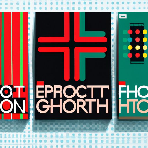
An eye-catching design can make your poster stand out and create a memorable impression. When creating your design, consider the use of colors, fonts, and imagery. Choosing the right color palette can evoke emotions and create impact. Fonts also play a critical role in poster design, as they can convey your message and personality. In terms of imagery, choose photos or graphics that are visually appealing and can reinforce your message.
It’s also important to follow best practices for layout. A well-organized and balanced layout can make a big difference in the overall look and feel of your poster. Consider using grids, rulers, and guides to align your design elements, and experiment with different sizes and variations until you achieve the desired visual hierarchy.
Keep it simple
Simplicity is key in poster design. A cluttered or overly complicated design can distract from the message you’re trying to communicate. Tips to keep it simple include minimizing text and balancing design elements. Use simple and concise language that is easy to understand and communicates your message effectively. Avoid using too many fonts or images that don’t support your message. Experiment with white space and negative space to create visual interest and emphasize key elements.
Proofread and edit
Proofreading and editing can make a big difference in the overall quality of your poster. Spelling and grammar mistakes can distract from your message and make your poster look unprofessional. Tips for proofreading include reading your poster out loud and asking a friend or colleague to review it. Make sure your poster adheres to your purpose and stays on message.
Print it out
Printing quality can make or break your poster’s impact. Use high-quality paper that is compatible with your printer and printing settings. Experiment with different printing settings such as color tones, saturation, and contrast until you achieve the desired result. Make sure to review a printed proof of your poster before printing large quantities.
Display with care
How you display your poster can also influence its effectiveness. Tips for hanging your poster include choosing appropriate materials such as adhesives, nails, or clips, and finding high-traffic areas where your target audience is more likely to see it. Make sure your poster is hung straight and securely, and replace it if it becomes damaged or outdated.
Conclusion
Creating an eye-catching poster requires a bit of planning and attention to detail, but the result is an effective and memorable form of visual communication. By following these seven steps – Identify your purpose, Choose the right size, Use an eye-catching design, Keep it simple, Proofread and edit, Print it out, Display with care – you can confidently create a poster that communicates your message and captures the attention of your intended audience.


