I. Introduction
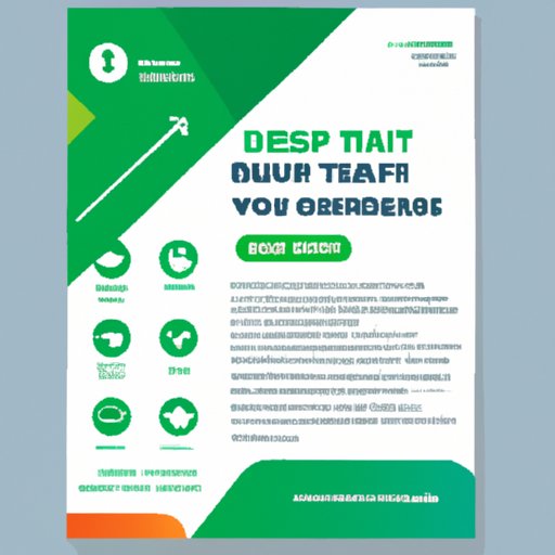
If you’re looking for cost-effective ways to advertise your products or services, creating a business flyer might be for you. Flyers are still effective in capturing the attention of potential customers and getting the word out about your business. This article will provide you with a step-by-step guide and expert tips to help you create an effective business flyer that stands out and gets noticed.
II. Step-by-Step Guide to Designing a Business Flyer That Attracts Customers
The first step in designing a business flyer is choosing the right design tools and software. This can vary based on your personal preference and skill level. Here are a few tools and software that you can use:
- Online design tools such as Canva, Adobe Spark, and Visme
- Design software like Adobe Photoshop, Illustrator or InDesign
- Microsoft Word or Publisher
Once you’ve picked your design tool and software, you need to move on to the next step, which is selecting the right layout and color scheme. Your layout and color scheme play a significant role in catching your target market’s attention and conveying your message effectively. Consider the following:
- Keep the layout simple and easy to read
- Use color schemes that match your branding
- Contrasting colors can add a significant impact to the overall design
Visual elements, such as images, illustrations, and graphics, are incredibly effective in getting your message across to potential customers. Consider the following tips:
- Use high-quality, high-resolution images and graphics to make your flyer stand out
- Incorporate graphics and illustrations that align with your message and branding
- Use large, bold texts to highlight your message and titles
Lastly, your flyer’s content is crucial. You need to provide clear and concise information that answers your target market’s questions about your business. Consider the following tips:
- Focus on what makes you stand out from your competitors and highlight this in your flyer
- Use bullet points or numbered lists to make your message more accessible
- Give details on dates, times, location, and any other pertinent information
III. 10 Expert Tips for Designing High-Impact Business Flyers
Here are ten expert tips on designing business flyers that will stand out:
- Clear Legibility: Make sure the text is legible and easy to read even from a distance by making use of contrasting colors.
- High-resolution images: Use high-quality images with high resolutions to make them look clear on the flyer.
- Playing with colors and contrasts: Make use of colors that compliment what your brand stands for and enhance readability by playing off color contrasts.
- The use of white space: Create a margin or border around the text with more white space for ease of reading.
- Choosing the right fonts: The chosen font must be readable and matches your brand’s personality and should not distract from the design of the flyer.
- The use of bullet points and number lists: Break up long paragraphs to provide your message clearly, and point out actionable elements.
- Creating a hierarchy of importance: Make sure the most important message is highlighted and placed at the center of the flyer.
- Keeping it simple: Stick with one message to avoid confusion, and make it easier to remember the message that prompted the flyer’s creation.
- Using attention-grabbing headlines: Use relevant headlines that entice readers to learn more about your product or service.
- Incorporating the company’s branding: Include your business’ logo and font style to show the flyer was produced by you, which in turn will help to build brand recognition.
IV. Creating an Effective Call to Action for Your Business Flyer
Your flyer’s call to action is crucial to convert an interested reader into a client. Below are several tips to help you create an effective CTA:
A call to action is the conclusion of your flyer’s message. After highlighting your message and what your business does, the primary role of a CTA is to get the reader to do something, whether it be take out a subscription or visit your website.
- Defining the term “call to action”: A call to action is a message that urges the reader to take immediate action that leads them in a specific direction or outcome.
- The importance of having a clear and concise call to action: Be specific about the actions you want your readers to take by mentioning it clearly in the call to action. This should indicate an action with a specific deadline.
- Using action words to encourage readers to take action: Words such as “Call Now,” “Subscribe Today,” or “Visit Our Website” highlight what you want your readers to do, and using these calls to action make it easier for your readers to act.
- Making it easy for readers to follow through: Place contact information, such as phone numbers and web addresses, where it is easily found, so readers can act on their impulse and convert into customers.
V. Maximizing Distribution: How to Get Your Business Flyer in Front of the Right People
Distributing flyers is crucial in getting them in front of the potential target market, and there are several distribution strategies for business flyers. Consider the following tips:
- Understanding your target market: Understanding your audience and their buying habits will determine the best distribution channels to reach them.
- Choosing the right distribution channels: Consider delivering flyers by mail, having them displayed in high-traffic areas, and distributing them at events that your target audience might attend
- Writing effective headlines and subheadings: Eye-catching headlines and subheadings are crucial and can spark interest as well as prepare the readers for the message that follows.
- Thinking creatively to get your flyers noticed: You can use a unique design, or placement in unusual locations to stand out from the rest.
VI. A Look at Successful Business Flyer Campaigns and What Made Them Work
It’s important to understand what made other business flyers successful, and you can apply those concepts to your design. Below are a few examples of successful business flyers and what made them work:
- Apple: The Apple advertisement is minimalistic and features an image of the iPhone and the date for their annual conference. This resulted in a flyer that was easy to read, with a clear message and the company’s brand displayed prominently.
- Coca-Cola: The Coca-Cola flyer design focused on giving away a free coke with the purchase of McDonald’s food. It’s bold in its design, and the color scheme jumps off the page and catches the eye.
- Procter and Gamble: This flyer design was for a Pampers diaper campaign. It features emotive imagery, captivating headlines and underlines the offer by providing a QR code for customers to begin signing up for the reward system.
You can apply the lessons learned from these successful campaigns to your flyer design. Emphasizing your message, creating a captivating headline or image to grab the reader’s attention, and highlighting relevant details in your call to action with clear contact information will undoubtedly help your flyers succeed.
VII. Conclusion
Designing a business flyer that attracts customers can seem daunting, but by following the step-by-step guide, incorporating expert tips, and a clear and effective call to action strategy, you can create flyers that get the word out about your business and its products or services. Practice designing flyers, and as you create your unique style, you’re likely to notice increased interest and conversions.


