Introduction
Graphing is a powerful tool that allows us to understand complex data quickly. Whether you’re a student working on a project or a business owner trying to analyze trends, graphs can help you effectively visualize and interpret data. However, if you have never created a graph before, it can seem like a daunting task. In this article, we’ll break down the process of creating a graph step-by-step, explain different graphing tools, breakdown graphing terminologies, discuss the importance of graphs and finally, we’ll troubleshoot and correct the common errors.
Step-by-Step Guide for Graphing
Creating a graph may seem intimidating, but it is a straightforward process if you approach it methodologically. Here’s a guide to take the stress out of graphing.
Step 1: Decide on a graph type
The first step to creating a graph is deciding on the type of graph you want to use. The most common types of graphs include line graphs, bar charts, pie charts, and scatter plots. Each graph has its own set of pros and cons and may cater to a specific type of data.
Step 2: Choose the data to graph
Once you have identified the type of graph you need, the next step is to determine what data to include in the graph. You need to consider which variables to display on the X and Y-axis of your graph; the X-axis represents the independent variable, while the Y-axis represents the dependent variable. Ensure that you normalize the data before graphing.
Step 3: Enter the data into a software program
After selecting your data, you need software programs like Excel, Google Sheets, or even R to create your graph. These software programs allow you to enter data, assign variable types and select graph types. This step can be daunting for beginners, but software programs have inbuilt tutorials to guide you.
Step 4: Choose the axis labels and title
Be precise on your axis labels, ensure that you have a title and that it’s clear. This will make it easy to understand and interpret your graph. Choose an axis label that is clear concise and comprehensive.
Step 5: Choose the style and colors
The choice of style and color for your graph depends on the type of data and your goals. Consistency in color also makes it easier to follow patterns across graphs. Select colors that are easy on the eye and that can differentiate clearly between different data.
Step 6: Final check and adjustments
Before finalizing the graph, perform a check on your graph to ensure: that all necessary data has been included, that typos and other errors are rectified, the style and color are consistent with the goals of the graph. Once the graph is ready, perform an overview to see if it captures everything you needed.
Screenshots to explain each step
Here are screenshots of what each step of graphing a line graph in Excel would look like:


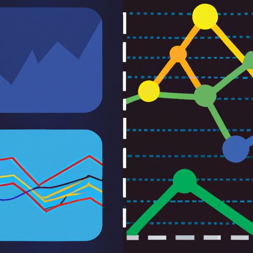
Infographics: A Graphical Approach
Infographics are a visually appealing way to display data in a way that is easy to understand. They combine graphs with other visual aids such as icons and illustrations to convey complex data in a way that is engaging and interesting to the viewer. Infographics are especially useful when presenting information that requires a lot of context to be fully understood, such as market research data.
Examples of Infographics for comparison


Benefits of using infographics
Infographics are an increasingly popular way of communicating data because they are easy to understand and visually appealing. They can be used to highlight key insights and give a summary of key data points in a format that is easy to read and share. Infographics also draw attention to the main concepts that a business is trying to communicate.
Comparing Different Graphing Tools
Most people are familiar with Microsoft Excel as the primary tool for creating graphs, but there are alternative graphing tools available. Below is a breakdown of some graphing tools available and their pros and cons.
Explanation of different graphing tools in the market
Here is a list of some of the most popular graphing tools:
- Excel
- Google Sheets
- R
- Tableau
Comparison of their pros and cons
Excel is easy to use and widely used. Google Sheets is free, easy to use and can be accessed anywhere online. R is a free statistical software that is useful for more complicated data. Tableau is a paid software that offers advanced features for data evaluation and presentation.
Indicative of scenario where a tool should be used
If you are looking for free software that is easy to use and has cloud storage, Google Sheets and Excel are your best choices. If you’re a professional statistician and need advanced tools, then R would be the best fit for you. For a business setting, where a lot of presentations are needed, Tableau is a great tool to consider.
Breakdown the Terminologies
It’s important to understand the terminologies when graphing for the first time, so here’s a breakdown of some common terminologies:
Common terminologies for Graphing explained
- X-Axis: This is the horizontal axis of the graph and typically represents the independent variable.
- Y-Axis: This is the vertical axis of the graph and typically represents the dependent variable.
- Legend: A legend is a visual aid that explains each line or color used in a graph.
- Data points: Data points refer to the individual pieces of information that are graphed.
- Data Series: A group of data points that are related and described
Examples and purpose of terminologies
For example, if you are graphing the height vs. weight of individuals, the X-axis will represent height, and the Y-axis will represent weight. The legend will be used to provide context for different colors or lines used in the graph.
Importance and Use of Graphs
Graphs are vital in data interpretation. Here’s why:
Explanation of why graphs are important
Graphs are essential in conveying complex information quickly and easily. They are also useful when determining trends, patterns, and correlations that might not be obvious without visual representation. With a glance, you can quickly understand data that could otherwise take hours to pore over.
How to use the best data from a scattering of data
With a large amount of data, Graphs make it easy to extract the relevant information from the dataset. They can also help understand the relationships between variables and their impact on one another.
Real-life examples of graph usage
Graphs are used in everyday life by businesses, schools, and healthcare professionals to monitor and evaluate performance. For example, a teacher could use a graph to evaluate the math performance of their students over the course of a semester.
Troubleshooting graphing issues
Even simple graphs require attention to detail to ensure accuracy. Below are some common mistakes and how to correct them.
Explanation of potential problems while graphing
Some of the common issues that occur while graphing include: including incorrect data, wrong labelling, choosing the wrong graph type, erroneous calculation in the software, and incorrect normalization of data.
Tips and solutions for fixing common errors
Double-check your data and the axis when entering data, and select the right graph type. When it comes to software analysis, ensure that you correctly input your formulas, and carefully normalize your data.
Examples of correct and incorrect graphs


Conclusion
Graphs are essential in data interpretation and can be powerful tools for businesses, schools and researchers alike. By following a step-by-step approach, understanding the various terminologies, and using different graphing tools, you can create compelling and insightful visuals that make understanding data simple and easy. We encourage you to try creating graphs for your next project or presentation.
Key takeaways
- Graphs quickly convey complex data in an easy-to-understand format
- Choose the correct graph type that presents the best data
- Software programs like Excel and Google Sheets help in graphing
- Double-check your data, labeling, and normalization
- Infographics are an alternative option to convey data
Call-to-action
Don’t be afraid to experiment with different graphs and tools to convey data. Graphs make understanding data easy and fun and could make the difference in your next project.