Introduction
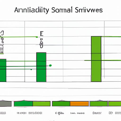
Excel is a powerful tool for data visualization, but it can be challenging to visualize data that differs significantly in scale or units. One solution to this problem is to add a secondary axis to the chart. This article provides a step-by-step guide on how to add a secondary axis in Excel, explores the benefits of using a secondary axis, and provides best practices for users. Whether you’re a beginner or an advanced Excel user, this article can help you create more visually-compelling charts.
A Step-by-Step Guide
To add a secondary axis in Excel, follow these steps:
1. Select the data you want to use in your chart and go to the Insert tab.
2. Click on the chart type that you want to use, such as Column or Line.
3. Right-click on one of the data series and select “Format Data Series.”
4. In the “Format Data Series” pane, click on “Series Options.”
5. Check the box next to “Secondary Axis” and click “Close.”
6. Right-click on the secondary vertical axis and select “Format Axis.”
7. In the “Format Axis” pane, adjust the scale, labels, and other options to fit your needs.
8. To add additional data series, right-click on the chart and select “Select Data.” Follow the same steps to add a secondary axis to the new series.
Exploring the Benefits of a Secondary Axis
Adding a secondary axis can be beneficial when you’re visualizing data that differs significantly in scale or units. For example, if you want to compare sales data for two different products that have vastly different sales numbers, using a secondary axis can make the differences clearer. Similarly, if you’re tracking data over time but the units or scales change dramatically, using a secondary axis can help clarify the trends.
Best Practices for Adding a Secondary Axis
While adding a secondary axis can be useful, it’s essential to do it in the right way to get accurate results. One of the best practices is to avoid using a secondary axis if it’s not necessary. It’s also essential to choose the right type of chart for your data. For example, if you’re comparing data using different units, a stacked column chart may work better than a line chart. When formatting the secondary axis, ensure that it matches the data series and is easy to read.
Customizing the Secondary Axis
You can customize the secondary axis to match your chart’s design and style. To do this, right-click on the axis and select “Format Axis.” From here, you can adjust the axis’ font, color, and other visual elements. You can also change the axis’s minimum and maximum values, invert it, add a title or label, and adjust the tick marks and scale.
Alternatives to a Secondary Axis
While a secondary axis can be helpful, it’s not the only way to visualize data that varies significantly in scale or units. One alternative is to use separate charts to display the different data series. Another option is to use a bubble chart that scales the bubbles accordingly. Before deciding which method to use, consider your data’s complexity and how different data series relate to each other.
Compelling Use Cases for a Secondary Axis
There are several compelling use cases for adding a secondary axis to a chart. For instance, you can use it to compare the performance of different products or track changes in temperature and precipitation over time. Using a secondary axis in these situations can help users better identify trends and gain insights into their data.
Conclusion
Adding a secondary axis in Excel can be an effective way to visualize complex data. By following the steps outlined in this article, users can create visually-compelling charts that accurately reflect critical data trends. Additionally, by exploring the benefits of a secondary axis and best practices for formatting and customizing, users can optimize their data visualization. Now you can create charts that are both professional and visually appealing with Excel’s secondary axis.


